of 3D
To understand how to create the illusion of 3D in 2D photo you need to start with an understanding of how we sense 3D in person then try to find ways to mimic it in a 2D photo
In real life objects and our POV move around and most of the clues about 3D spacial relationships come from parallax shift and shifting focus between near and far objects. Both are techniques used in movies to create a sense of separation in 3D space which aren't possible in a 2D photo.
Other clues about 3D spacial relationships come from near/far perspective. Optically its a function of viewing distance between lens, near object and far object not focal length. With any focal length lens, be it in the eye or on a camera, the near/far size relationship changes with distance. If you stand with nose pressed to a mirror and walk backwards the near/far perspective will change from distorted to what you perceive as more "normal" in person. The perception of "normality" by eye forms a baseline for evaluating near/far perceptive and spacial relationships in photographs. By way of lens selection and shooting distance a photographer can make the near/far relationship of objects seem normal or exaggerated. Using a UWA very close to the near object will exaggerate the relative size of the foreground more than "normal" (i.e. what the viewer would expect). Using a long telephoto lens to achieve the same in camera crop of the foreground from much further away will make the foreground seem "normal" but exaggerate the the size of the background object. All three -- normal, WA and telephoto -- provide clues about 3D space in the photo but in different ways. Of the three using a WA lens close to exaggerate the relative size of the foreground would tend to create a stronger illusion of 3D space than a normal (matching eye) or telephoto shot in which the background looms larger than life (i.e. seen by eye).
Optics notwithstanding it is the content in the photo which provides clues to perspective and metaphors in implied messages, such as the obligatory shot of the senior standing on the railroad tracks receding into the horizon forming an arrow leading out of town and sending the message "I'm outta here ASAP". The same shot with the same lens from the same distance without the tracks wouldn't send that message. If shot on Main Street is would imply the opposite, "This is my small universe and I'm planning to stick around here."
That raises an important point to consider. You should give some thought to the implied message of the photo before using any photographic technique to render a scene. Look at it with your eyes -- the baseline for normal -- then consider how the content will be perceived by the viewer of the photograph if you choose to render in way that doesn't look normal in the photo. When technique fits the context of the scene and message it strengthens the message and won't be noticed much. But if the technique produces results which are out of context with the implied message then the viewer, especially if they are a photographer, will focus on the technique used instead of the message. I cringe whenever I see anyone comment "Great Bokeh" in a C&C because it means they were paying less attention to whatever was in the foreground.
Selective DOF in a photo mimics two aspects of human perception, one physiological and the other psychological. Our eyes have adjustable apertures which vary the DOF of the eye but the actual construction of the eye has all the color sensing cone cells concentrated in the center of the retina with the rest of it covered with rod cells which respond to a narrow band in the green part of the spectrum. Apart from the difference in color sensing the rods are about 3000x more sensitive to light than the cone cells. That's why at night we see out of the corners of our eyes better than when looking straight ahead.
As a result of the way the eye works due to its physical design when looking at any scene in person, or this message on the computer, it is only the center 2° of the entire FOV -- twice the width of your thumb held at arms length -- which the brain focuses all of its attention on with mental "tunnel vision". The stuff on the periphery of our vision is sensed but not focused on mentally until the very sensitive rods detect some contrast in movement or brightness which shift attention over to that spot.
Isolating a foreground subject with shallow DOF mimics both the narrow DOF of the eye and how the brain mentally tunes out the edges of the our FOV when focusing attention on any part of it. The OOF parts of the image tell the viewer "I'm not important, go find the sharply focused stuff in the photo." forcing the brain to move the eye across the photo. On a psychological level that movement of the eye across the 2D photo from blurred content to sharp creates both an impression of 3D space and more importantly is what creates the sense of dynamic movement in the photo.
Taking the same content with the same DOF and place it dead center in one photo ...

...but off center in another...

... creates a different reaction in the mind of the viewer because when the focal point is centered they will tend to go to it first and stay there if there is no strong clue where to go next. But when the same focal point is moved to the right side of the photo the natural tendency will be to "read" the photo left to right like text and scan over the content and context it creates on the left side en route to the contrasting focal point.
The cliche is that a "Photo is worth 1,000 words" but those words and the implied story in the photo are formed entirely in the mind of the viewer and largely dependent on what order the the viewer sees the content in a photo and "connects the dots" between them. If the placement of the focal point is reversed and it is placed close to the left edge of the photo the tendency will be for the viewer to see it first before the context contained in the rest of the photo to the right...

The contrast gradient in a photo -- line, tone, relative sharpness and near/far size relationships between foreground and background -- provide a "roadmap" for the brain of the viewer to follow in a 2D photo they wouldn't need when looking at scene in person.

Photographers today seem to get obsessed with technical perfection in the gear such as the ability of a lens to record the scene with even illumination and razor sharpness in every pixel. But one of the things which gives older photographs a more natural organic feel is the way their technically inferior optics tended to vignette and soften the corners of a photo: what is needed to simulate how the brain "tunnels" its focus on whatever is in the center 2° of 140° field of view of the eyes.
Magic tricks are based entirely on the magician's understanding of what the audience expects to see. Then armed with that knowledge they can devise clever ways to trick their brains into not seeing what they are actually doing. In similar fashion the photographer with an understanding of the dynamics of human perception and can very predictably control the order in which the viewer sees the elements in the photo which create the storyline in their mind.
Like jokes, visual narratives are usually most effective when the "punchline" and connecting of the dots of the message come at the end of the eye path rather than the beginning.
The other aspect of 3D in photos is shape. In person we learn the 3D shape of objects in infancy from our first toys: basic shapes like ball, cubes and donuts in rainbow hues. What those playing with those shapes does is program the brain to connect shapes with the lighting clues on them....
The contrast gradient in this illustration leads the eye to the intended focal point, across any less important context....

But it is the lighting pattern and tonal contrast it creates on the object which makes it look 3D or not in a 2D rendering...
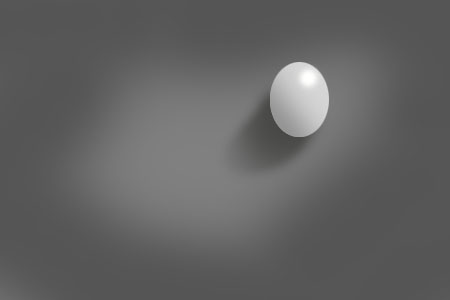
There are many different clues which affect perception of shape but the reason you recognize the 3D shape in the focal point is because you brain has millions of stored memories of seeing egg shaped objects with a natural downward lighting pattern on them. Your brain matches the pattern to stored memories and tells you "Hey that's an egg in the photo, not a face".
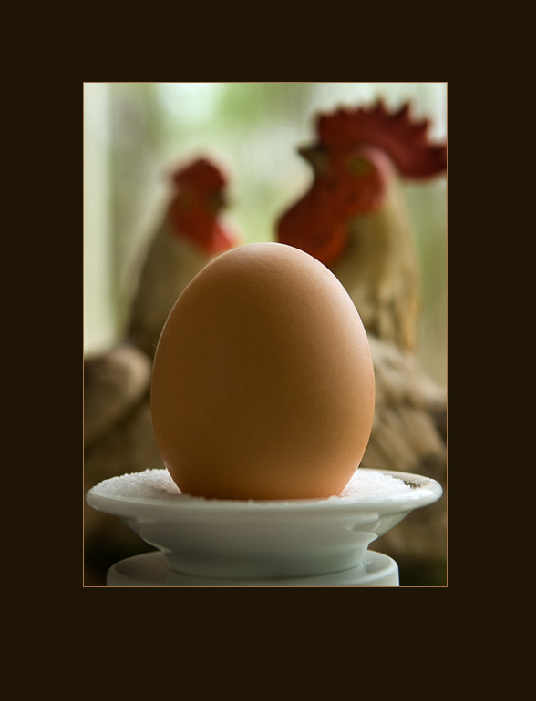

The 3D shape of a face comes from the same clues - highlights falling where natural light typically places them on the highest parts relative to the overhead light source: tops of cheeks, ridge of nose, top of chin and lips, which corresponding shadow angles beneath them in the lower parts of the face seen more clearly if the image is blurred...

There are an infinite variety of ways a face can be lit but only a limited number which will render the 3D shape of a face with a "mask" pattern of contrast the brain of the view will instantly recognize based on the contrast pattern alone. When people see Jesus in their burnt toast he's not in "broad" or Rembrandt lighting he lit from 45° above the eyeline and 45° to the side. Why does that create the illusion of 3D in a 2D rendering? Because it matches the pattern our perceptual baseline of natural light sees things in most of the time. Why do many flash lit shots look fake? Because the angle of the light and the highlight and shadow clues are in the "wrong" places relative to that natural baseline.
Two patterns which define 3D shape of a face best on darker backgrounds are centered butterfly for full face views and "short" lighting with the key light 45°V45°H from the bridge of the nose for oblique and profile views. On white backgrounds the tonal dynamic flips. Butterfly also works for full face, but short lighting on white will make the brighter far side of the face in oblique and rim lit profile disappear into the background. The more effective choice for oblique on white is low ratio 2:1 broad lighting which makes the far side darker contrasting it well with the background at the same time the brighter side of the head blends in - the same cause and effect of contrast of short lighting on dark in reverse. Contrast attracts the eye and provides clues about spacial relationships and shape.
Back in the mid-70s I worked at National Geographic doing all the photomechanical steps for its map. One task was making a halftone image of the mountain relief. A cartographic artist, using a pencil, would draw the shadows the mountain relief would create in the mid-afternoon sun when it was at a downward angle of 45°. That's the only clue the brain needs to discern the 3D shape of the mountains and their relative size on the map.
The same thing is true in photos. Most of the clues to shape and the impression lighting is "hard" or "soft" come from the shadows angle, size and tone. The tone of the shadows in a photo create the hard/soft dynamic. In person we perceive things with an average lighting ratio of about 3:1 reflectance difference between highlight and shadow. Even when the light has more actual contrast the adaptive pupil and the brain's filtering of the input make us see more shadow detail than a camera can record.
When a portrait has a 3:1 lighting reflective ratio the key light is 2x brighter than fill.
H:S
1:1 even fill
2:0 overlapping key light 2x stronger
===
3:1 reflected ratio
It looks "normal" because it matches how we perceive things most of the time. But when the ratio gets greater and the shadow are darker than "normal" the perception changes. It's not so much the impression of the shape of the face that changes because the shape is recognized from memory of what heads look like in 3D. What the change in lighting ratio does more so is change the perception of the environment the person is in (dark = abnormal and scary / dangerous) and with it the implied mood or attitude of the person. When shadows get lighter than the "normal" 3:1 perceptual baseline they infer the opposite (light = safe / secure / free from worry).
Key light angle and the shadows they cast send clues about environment and outdoors the time of day the photo was taken. High sources creating long loopy nose shadows will clue the viewer that the source of the light is on the ceiling indoors or high-noon outdoors. When shadows are low and sideways in an indoor shot it looks rather odd unless there is context, such as a low window or lamp in the shot to explain the other than "normal" lighting. Outdoors long sideways shadows tell the viewer the sun is rising or setting conveying a sense of time context. When flash is added to the foreground outdoors at angles not matching the natural lighting it sends a confusing message and looks unnatural because the context of the foreground and background shadow clues don't match.
Much of the "pop" factor in lighting comes from the perception of the highlights. The best example of this is trying to photograph a black dog on a dark background or a white dog on a white one. The impression of 3D shape of the black dog needs to be defined with backlight to create separation between dog and background. The only way to create spacial separation for the white dog on the white background is to make the background a slightly darker shade of white so the dog contrasts and looks brighter relative to it. The darker "off white" background will also allow rim lighting, if used to contrast and define shape and spacial separation.
How the texture of the fur looks in the photos of both depends on the degree to which the light sources create sharply defined specular reflections on the hair shafts. On the black dog it will be difficult to define the texture with shadows so the clues must come from the highlights. Using a shiny silver umbrella or direct flash directly over the camera will create even fill and specular highlights at the same time and created a better illusion of 3D that diffuse omni-directional lighting would. For the white dog the same sharp specular highlights are needed to contrast with the white fur, but shadows can also provide clues. So a combination of a specular fill source and cross lighting with another direct source will create the most realistic impression of 3D in a photographic reproduction.
There are no simple "one size fits all" or playbook solutions. You need to start with the message you are trying to convey, identify its "punchline" visual focal point, find ways to contrast it from everything else, then compose it in the frame in a way that will guide and compel the viewer to scan over all the context necessary to understand the "punchline" and message of the photo.
As with a joke timing is everything in telling the story and the story only works if the audience can relate to the punchline when it is delivered. That's where the 3D aspect and the "normal" baseline of expectations come into play. If the viewer doesn't unconsciously accept the focal point image as being 3D the magic trick of a 2D photo doesn't work, unless the desired message its to make the scene look flat and two dimensional.

Holistic Concepts for Lighting
and Digital Photography
This tutorial is copyrighted by © Charles E. Gardner.
It may be reproduced for personal use, and referenced by link, but please to not copy and post it to your site.
You can contact me at: Chuck Gardner
For other tutorials see the Tutorial Table of Contents