Why we don't see distractions when we shoot
The human brain and eye work together in concert separating signal from noise in the constantly changing 150 degree panoramic vista our stereoscopic vision perceives in front of us. The eye records everything but the brain filters out most of it, directing the eye to focus only on what you consciously think is most important in the scene; the center of interest (COI). This "tunnel vision" will cause a photographer to miss distractions behind and around the COI.
Putting eye to viewfinder narrows the range of our vision to what the camera lens crops, but unfortunately a camera doesn't have a brain filter and will faithfully record everything in its field of view including distractions like a tree behind a subject which in the photo may appears to be growing out of the subject's head.
The instinctive tendency for most photographers is zoom the field of view from outside in while staying focused on the center of interest.
When lost the first thing one does instinctively is look for the most prominent landmark to determine which way to travel. When looking at a photograph the eye will instinctively search for the area of greatest contrast with the background.
If the area of greatest contrast is not the center of interest the photographer intends for the photo, the viewer's eye will either have difficulty finding the COI or will be pulled back and forth between the COI and the area of greatest contrast.
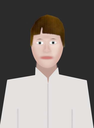
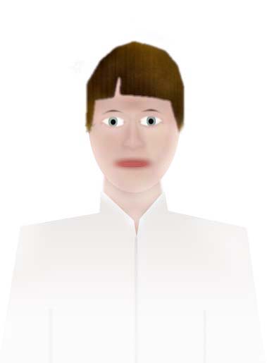
For example, in a portrait of a person in white shirt on a dark background the face is the desired COI. Because making eye contact with people is also instinctive a viewer will typically find the face first and make eye contact, but then almost immediately be drawn toward the larger white shirt by its contrast.
Asking yourself, "What do I want the viewer to think is most important in this photo?" is the start of a mental checklist which will lead to more effective messages.
The next question to ask is, "Is there anything else in the photo which will attract the viewer away from my intended Center Of Interest?" In the first example above on the black background the answer would be yes, the white shirt. Either changing the background to white or the shirt to a color darker than the face would solve the problem. Usually the photographer has little control over the clothing the subject is wearing, but can choose the background.
A photograph is only as good as the sum of how its parts mesh together so it is very important to get past the "tunnel vision" on the face or other center of interest to look at the tonal balance of the entire scene the camera is recording. By pausing to ask those two simple questions above, potential distractions can be spotted and eliminated making the presentation of the subject more effective.
Multiple Centers of Interest
Portrait photographers are frequently confronted with challenges like the one illustrated below. A couple wants a photo with their white dog. Their clothing doesn't match each other or the background and the white dog because it is so bright will contrast the most and attract the most attention in the photo.

- White dog
- Cyan shirt on left
- Faces
- Bright hand on shoulder
- Hands under dog
- Background
- Burgundy shirt
 Next I note the path my eye travels in the photo as it moves between the most attractive areas and a point of balance between them, represented by the red dot. That point of visual balance in the middle of the path the eye travels in the photo becomes the "virtual" center of interest. Virtual because it is not any one of the individual centers of interest, but rather a point of visual equilibrium between them.
The illustration above is based on a photo I recently critiqued and use in my tutorial Background and Clothing Considerations to discuss how to deal with distractions like the white dog. In this case I suggested hiding the dog in plain sight by changing everything in the photo except the warm toned faces of the people, who both had gray hair, to a monochromatic color scheme:
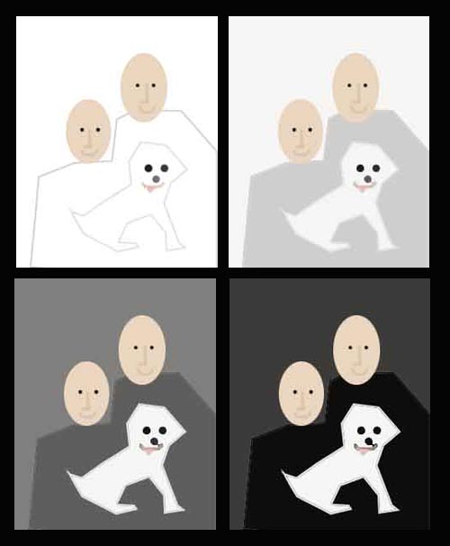
Look at each one and let your eye settle on a balance point between the faces and the dog.
| Upper Left: Where's the dog? |
Upper Right: The light background balances the attraction of the white dog and eye finds equilibrium slightly above the dog's head between the chins if the two people. |
| Lower Left:
There is all good overall balance between the darker background and clothes. The eye tunes them out and the balance in the photo is determined by the relative attraction of the faces and the dog. The equilibrium point moves down to the left of the dog near the chin of the person on the left. |
Lower Right: The darkening of the background makes the dog contrast more than the faces, shifting attention and visual equilibirum away from the faces and towards the dog. |
Positioning the Center of Interest in the frame
A photo compresses the normal wide field of vision into narrow rectangular box which freezes a moment of time, but the human eye looks at it the same way to looks at everything else: it is attracted by contrast and will wander around to discover what is interesting in the photo. There are many principles and techniques of composition but they all have the same goals: lead the viewer's eye somewhere and make the trip interesting. Doing it effectively in a photo is a bit like catching a fish; first you set the hook, then you reel it in.
The "hook" is a dominant tonal center of interest; something so compelling it will pull the eye past everything else to get to it. My technique is to set the hook by making the intended center of interest in the photo contrast more strongly with the background than anything else in the photo. The COI must be the lightest area a dark background or the darkest, most saturated warm tone on a light one. This technique isn't always possible outdoors in natural light, but it is in a studio where all the variables can be controlled by the photographer.
The creating the illusion of movement
The sensation of movement, or what I call the visual dynamic in a photo is created by the placement of the center of interest in the frame.
Centered in the frame
 If the COI is placed in the exact center of the photo the composition will create the impression it is at rest, neither coming or going; static, and centered.The eye of the viewer will immediately find the COI in the center, but then be tempted away from it by the urge to explore the space above it.
Placed in the upper half
 If the COI is placed in upper half of the photo the composition will create the impression that either the COI has traveled from the position of the viewer, or that the viewer would need to travel so distance to reach it. The eye of the viewer will travel over the larger foreground to reach the center of interest of the photo.
Placed in the lower half
 If the COI is placed in lower half of the photo the composition will create the impression that COI is near the viewer and plans to move way, or has traveled from distance towards the viewer. The eye of the viewer will immediately find the COI in the foreground, but then be tempted away from it by the urge to explore the larger space behind it.
Two out of the three possible locations for the COI in the frame - centered and below center - create empty space beyond the COI which is an invitation for the eye of the viewer to go somewhere else.
No matter how compelling the center of interest is the viewer will eventually tire of looking at it and wander off to explorer.
If we want multiple centers of interest that's OK, but as explained below you'll want to guide the viewer to next most important thing in the photo and create a path back to the primary COI where the trip around the photo started.
In a conventional portrait the front of the face is always the center of interest in the photo and the eyes are always the primary center of interest on the face. An effectively composed conventional portrait is one in which arms, hands, cleavage, jewelry. etc. are subordinate to the face.
When a photo only has a single COI, the ideal way to "reel" the eye in towards it is to put everything of secondary interest on the photo on the most compelling visual path to the COI.
Putting the eye line of the subject near the upper third of the photo is a very effective composition strategy because it creates a path from the bottom of the photo to the face which includes everything of secondary interest to the face, and provides very little space and thus little temptation to explore the area beyond the COI. The view sees every on the way to the face so there is no compelling reason to wander away from the COI. That in a nutshell is what I consider visual effectiveness.
The "Rule" of Thirds gets a bad rap
Some people make a big deal out of the rule of thirds, feeling that anything with the word RULE in it restricts creativity. What a load of bull!!!! There is no rule in heaven or on earth that will restrict a person who is creative. Creative people don't follow rules they follow their feelings.
All that the rule of third does is simplify the explanation of what I just demonstrated above about the impression the placement of the center of interest has on the viewer and how it predicts where the viewer's eye will go AFTER it finds and tire of looking at the COI.
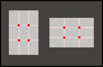
Why Thirds?
This answer will probably befuddle the ROT bashers, but the reason it is the rule of thirds, not forths or 7/8ths is because when a dynamic COI is placed on at third node where the lines intersect the photo FEELS balanced.
Photos are small boxes of reality. To keep the viewer in photo it is necessary to create a visual buffer of uninteresting stuff at the edges of the photo.
I suggest trying to keep anything which will attract or lead the eye away from the edges of the photo to prevent pulling the viewer out of the photo. I use the inner rectangle formed by the intersecting thirds as part of my mental checklist. If notice something outside of it I ask myself whether it leads to or away from what is most important in the photo. The exception is when there are two equally strong centers of interest in conflict. For example a tennis photo of two players on the baseline with the empty court between them will make it feel like a tennis match, more that a close up freezing action at net would.
Don't loose the fish on the way to the boat
The risk during the reeling-in phase of fishing is snagging and breaking the line. The same is true in a photo. You want the viewer's eye to pass over the areas of subordinate interest without pausing and getting sidetracked. That's what happens in a portrait when it contains unnecessary distractions such as a hand or arm which is brighter than the face on a dark background.
A conventional portrait is all about the face and eye contact with the subject in it. Before adding anything other than the face to a portrait I perform the following mental checklist:
- Does it blend into the background (good) or contrast with it? (bad)
- Is it between the bottom corners of the photo and the face?
- Does it attract the eye towards (good) or away {bad) from the face?
- Does it attract or lead the eye towards the edge or corner of the photo? (bad)
- Is there a stong visual path from it back to the face? (good)
- Would its absence be noticed or make the person appear unnatural?
The last one which is the most important one. If it will not be missed, don't put it on the photo. In a group photo It's not necessary or a partically effective strategy to have ten hands on various shoulder, laps, etc. showing. They create 10 distraction from the 5 faces and will not be missed if posed in a way which looks natural but hides them in deep shadow or completely out of sight!
Controlling eye movement between multiple centers of interest
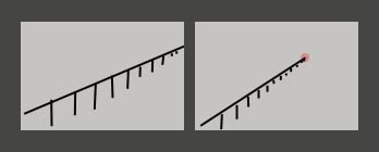
Leading lines are the second most powerful attracting force in a photo. Humans are curious critters; they see a line they want to follow it and see where it leads. In many of photos I critique leading lines lead eye out of the photo or into a corner and leaves it stranded.
I have a slightly different approach to leading lines than any I've ever read in a photography or composition textbook:
- Lines leading to the COI aren't really necessary in most cases: If the COI is established using contrast, as outlined above, the viewer will find the COI easily and always gravitate back to it regardless of where it is lead in the photo.
- Lines leading to the COI aren't really desirable in most cases: When the viewer's eye tires of looking at the COI it will search for a visual clue where to go next. Lacking any it will head back down to the starting point along the same path rather than stay on the COI.
- Use leading lines to guide the eye away from the primary COI to the next most important thing in the photo: If there is one tonally dominant COI in a photo the eye needs some other clue where to go next. Lines leading away from the primary COI to secondary areas of interest provide such as clue with conflicting tonally. A good example of this is the posing of arms and hands in a conventional portrait. The contrasting tone of the face should pull the eye directly to it, then the shape of the arms can be used to eye down one arm to the hands and then back up the other arm to the face.
- Leading lines are most effective when the path between multiple centers of interest is smooth and circular: Unless a feeling of tennis match tension or unrest and chaos is intended its not effective to have the viewer's eye darting around a photo at random. As the white dog example illustrates it is actually quite easy to guide the eye of the viewer around the photo is a way which is predictable in advance by controlling the relative contrast between each COI and the background. Leading lines are the roadsigns at intersections which tell the eye where to go next.
That's how I see photographically.
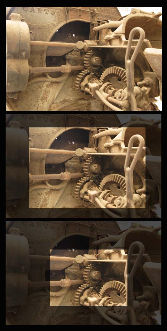
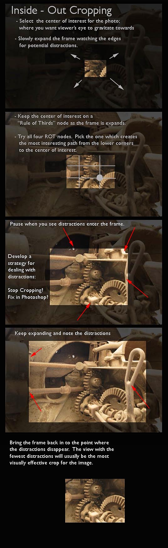
Try it inside-out cropping while shooting and editing. You might like it. If not, no problem; don't use it...
Holistic Concepts for Lighting
and Digital Photography
This tutorial is copyrighted by © Charles E. Gardner. It may be reproduced for personal use, and referenced by link, but please to not copy and post it to your site.
You can contact me at: Chuck Gardner
For other tutorials see the Tutorial Table of Contents