One of the more interesting things I did in my career was operating copy cameras for several years at National Geographic in the mid-1970s. One of the cameras filled an entire room and had a 6 x 8 foot copy board and a 30 x 40 inch film back. From National Geographic I moved on to managing printing where I had occasion to color separate and print art catalogs from customer supplied transparencies. As such I'm aware of process control factors beyond just capturing the image that need to be addressed when shooting art to ensure the most accurate possible reproduction.
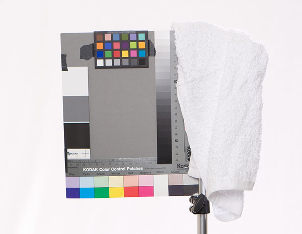
The standard copy camera set up is lights at 45 degrees to the glass copy board. When the lights are angled that way the reflections of the lights are not seen from 0 degrees on the camera axis. Fire a flash angled at 45 degrees to a mirror with the camera square to the mirror and you'll see what I mean. At 45 degrees the flash will light the mirror but the reflection will not be seen by the camera oriented at 0 degrees. So while polarization certainly will not hurt, it should not be necessary for flat art such as watercolors on matte paper if you set your lights correctly. We routinely made halftones and color separations from glossy photos on glass copy boards without any reflection problems. Where cross polarization is needed is when photographing irregular surfaces which reflect the light off the side at angles which cause the camera to see the specular reflections: an acrylic or oil painting with heavy textured brush stokes for example. Cross polarization can kill some or all of the reflections. Kill all of the reflections and the impression of texture in the painting will be lost. Mostly it depends on how the photos will be used. When in doubt shoot both ways. Don't shoot the art angled on an easel. Find a blank wall in a room where you can turn off all the lights. Your biggest problem with reflections will not be the lights you use to shoot the art but other sources hitting the glass and reflecting into the camera. Here's a simple set-up to ensure the art is square to the camera: Measure off a square on the wall bigger than the largest painting with the center at the height of your camera on the tripod. With painters (non stick) masking tape create an X on the diagonals. Put small mirror over the center of the X. With a bubble level in the hot shoe or tripod QR, level the camera then adjust until you can see the reflection of the camera lens in the mirror. You might be able to see your eye in the viewfinder. That will put your camera square to the wall with the center of the X on the lens axis. Then all you need to do is use the tape as a guide for the corners of the artwork to keep them centered on the lens axis and square relative to the camera. Set the lights for even lighting on largest painting (more on this later). You will only need to do the set-up once to shoot all the art and the exposures of all will match. Other key concerns are even exposure and color fidelity. We insisted that all photos of artwork contain a Kodak Q-13 color separation guide. It consists of the grayscale on the right and color target printed using offset process inks on the bottom of this lighting test shot below. An even better color reference today is the MacBeth ColorChecker, the target on top. Its colors are also within the gamut printing presses and ink jets can reproduce. The target on the left is a QP card. They come in packs and are relatively inexpensive and ideal for putting around the artwork to monitor exposure evenness.
Holistic Concepts for Lighting
and Digital Photography
This tutorial is copyrighted by © Charles E. Gardner.
It may be reproduced for personal use, and referenced by link, but please to not copy and post it to your site.
You can contact me at: Chuck Gardner
For other tutorials see the Tutorial Table of Contents